
Turning special moments into a keepsake is a meaningful act. A custom calendar makes timekeeping personal and unique. It’s a thoughtful holiday gifting choice.
This guide covers the whole process, from planning to printing. We start with picking the right photos and planning. Then, we talk about design, like layout and fonts.
We also look at paper types and finishes. The last step is choosing a printer to get the best results. Each part is explained clearly.
Our aim is to help you create with confidence. Whether for business, family, or gifts, this guide helps. You’ll make a personalized piece that’s both beautiful and meaningful.
Storyboard the Year: themes, milestones, seasonality
Planning your calendar’s story is key to making it special. This step, called storyboarding, adds meaning to your wall hanging. Without it, your calendar might feel disjointed.
Start by picking a visual theme. This theme guides your choices. It can be family photos, travel, nature, or a hobby.
Your theme affects which photos you pick and how you arrange them. A consistent theme brings harmony. It tells a clear story of your year.
Popular Calendar Theme Ideas
| Theme | Description | Monthly Photo Focus |
|---|---|---|
| Family Growth | Chronicles your family’s year through portraits, candid moments, and milestones. | Monthly family photos, birthday celebrations, holiday gatherings. |
| Travel & Adventure | Showcases journeys, landscapes, and cultural experiences from your trips. | Photos from specific vacations or local explorations matching the season. |
| Nature’s Cycles | Highlights plants, animals, and landscapes, showing seasonal changes. | Spring blooms, summer beaches, autumn foliage, winter snowscapes. |
| Pet Companions | Features your furry (or scaly) friends in their daily antics and adventures. | Playtime, naptime, holiday costumes, and outdoor fun. |
Then, find your milestones. These are the highlights of your year. Include birthdays, anniversaries, and holidays. Also, mark business goals and personal achievements.
Adding these dates makes your calendar look intentional. Each event adds to the story.
Use seasonality to your advantage. Choose photos that match the mood of each month. A cozy fireplace fits December, while a beach scene is perfect for July.
This approach makes your calendar feel natural and emotional. It aligns with the year’s natural flow.
The best tool for this is a simple month-by-month grid on paper. Write down your theme, milestone dates, and seasonal photo ideas for each month. This plan is your guide.
This storyboarding ensures your photo calendar tells a story. It goes from being a simple item to a meaningful reflection of your year.
Photo Selection: resolution, cropping, editing pipeline
Blurry, pixelated photos can ruin a beautiful calendar design. This section helps turn your images into crisp, print-ready artwork. We’ll cover the technical specs and editing steps you need.
The key for print is 300 dots per inch (DPI). This 300 dpi ensures sharp details on paper. Images from smartphones or social media often don’t meet this standard. Always check the resolution first.
Why is 300 dpi so important? A lower resolution might look okay on screen but will be soft when printed. Printing uses tiny dots of ink. More dots per inch means better detail and smoother edges. Always start with the highest resolution images you have.
Your editing pipeline turns raw files into calendar-ready gems. Follow these steps for the best results.
| Stage | Key Action | Tools & Techniques | Quality Check |
|---|---|---|---|
| 1. Resolution Check | Verify image is at least 300 dpi at final print size. | Photoshop ‘Image Size’ dialog; batch metadata viewers. | Image holds clarity when zoomed to 100%. |
| 2. Cropping & Composition | Frame the subject for your specific calendar grid layout. | Rule of thirds; clipping masks in PSD templates. | Key elements aren’t cut off; negative space is balanced. |
| 3. Color Correction | Adjust white balance, exposure, and saturation for consistency. | Adjustment layers; batch sync in Lightroom. | Colors look natural and match across all monthly photos. |
| 4. Sharpening & Final Prep | Apply subtle sharpening optimized for print output. | Unsharp Mask filter; high pass filter technique. | Details pop without introducing harsh halos or noise. |
Strategic cropping is key. A square layout needs a different composition than a horizontal rectangle. Think about how the date grid will overlay your image. Use clipping masks in your design software to test fits quickly. This non-destructive method lets you adjust positioning easily.
Batch editing is your friend for consistency. Apply the same color correction preset to all images from one event or season. This creates a cohesive visual flow from month to month. Adjust individual photos as needed, but start with a unified base.
Lastly, assess sharpness. Zoom in to 100% on your screen and look for clean edges. Proper high-resolution files will show detail, not blocks of color. This careful preparation pays off dramatically in the final printed product. Your calendar will feel professional and polished, worthy of displaying all year long.
Typography & Grids: legibility, hierarchy, spacing
Creating an effective calendar design means understanding the mix of typefaces and template grids. These elements are key to how your content is seen and used.
Typography is more than picking a font. It sets up a visual order that guides the viewer. The month name should stand out the most. Dates should be clear and easy to see quickly. Any notes or event labels must be easy to read without straining.
This order comes from contrast. Use a bold, large font for the month name. A clean, medium-weight font is best for numbers. For notes, a smaller yet readable style works well. Scripts add personality for month titles, while sans-serif fonts are better for dates.
Color is also a powerful tool in typography. Using a distinct color for weekends or holidays makes them instantly recognizable. High contrast between text and background is essential for readability.
Underneath all your content lies the template grid. This framework guides where every element goes. A well-designed grid balances images with date boxes and whitespace.
Think of the grid as a map. It sets up columns, rows, and margins. A cluttered calendar is overwhelming. Enough spacing, or “white space,” around date cells and photos makes the design better.
Consistency is key. Each month should follow the same grid structure. This creates a unified look throughout the year. Make sure your photos fit within the grid without covering important date info.
Many online tools and custom calendar planning tips stress starting with a strong grid. It’s the foundation of your project. Whether you’re modifying a template or creating your own, always start with the grid.
Here are key principles for using typography and grids together:
- Establish Clear Hierarchy: Month > Date Number > Event Text. Use size, weight, and color to differentiate.
- Prioritize Legibility: Fancy fonts can sacrifice readability. Test your choices at a small size.
- Embrace White Space: Empty areas are not bad. They prevent eye strain and highlight key elements.
- Align to the Grid: Keep all text blocks and images aligned to the grid lines. This creates a polished, professional look.
- Maintain Consistency: Use the same font families and grid spacing across all months for a unified product.
Mastering these basics lets you add personality without chaos. Your calendar becomes both beautiful and functional. The right typography and a solid grid turn a simple date tracker into a treasured keepsake.
Color Management: profiles, soft proofing, consistency
Seeing screen colors turn dull or mismatched on paper can be frustrating. It’s not about your printer’s quality. It’s a difference in how screens and inks create color.
Learning about CMYK vs RGB is key. Your monitor uses RGB (Red, Green, Blue) to mix light for vibrant colors. Printers use CMYK (Cyan, Magenta, Yellow, Key/Black) to layer inks on paper.
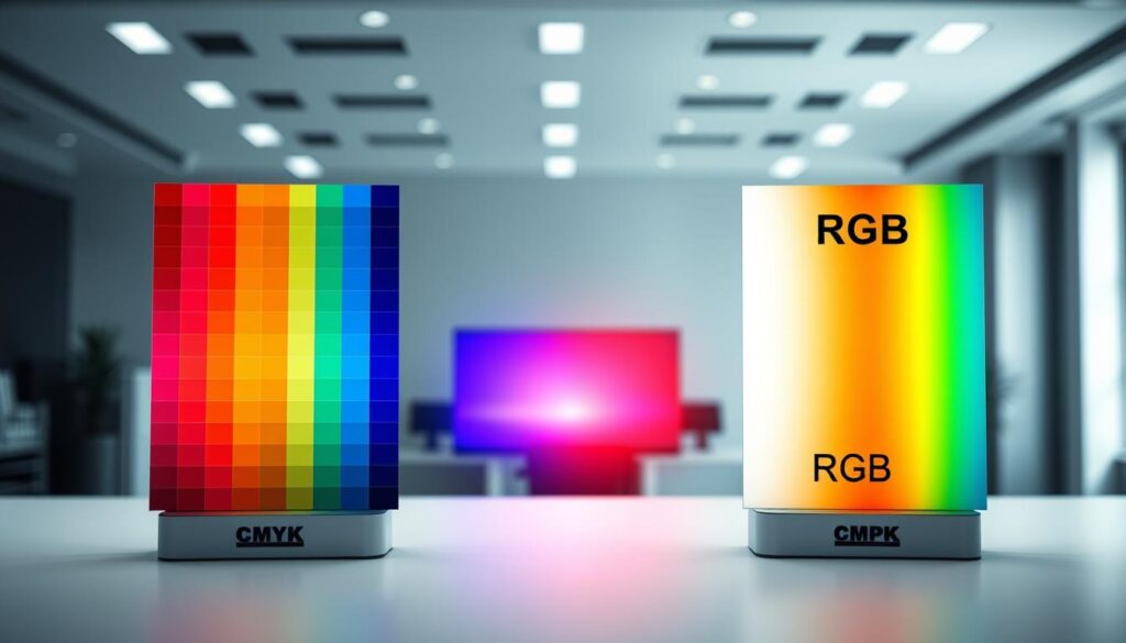
RGB can show colors that CMYK can’t. A neon green or vivid violet on your screen might print as a muted, earthy tone. Designing for the final medium from the start is the solution.
Always set your document’s color mode to CMYK before designing. This keeps you within the printable color range. If using Canva Pro, switch to CMYK for the most accurate print preview.
For more control, use soft proofing if your software allows it. Soft proofing shows how CMYK colors will print on your screen. This lets you adjust before sending files to the lab.
Keeping colors consistent across all twelve months is essential for a professional look. Here are some tips:
- Edit photos in CMYK: Make final color corrections and adjustments after converting images to CMYK.
- Use a limited palette: Stick to a core set of CMYK swatches for your design elements.
- Check under consistent light: Review physical proofs under neutral, consistent lighting to avoid color cast illusions.
- Order a single proof first: Print one month as a test to check color accuracy with your chosen lab before the full run.
Mastering the CMYK workflow helps bridge your digital vision to a beautiful, physical calendar. Your colors will be predictable, consistent, and true to your creative vision.
Important Dates: imports, recurring events, icons, QR links
Adding important dates to your personalized photo calendar saves time and makes it interactive. It turns a beautiful piece into a functional tool for the year.
Let’s look at how to manage dates efficiently and make them visually appealing.
Streamline Setup with Digital Imports
Entering many dates manually is boring. Today’s design software and online print labs let you import dates from your digital calendars.
Just connect your Google Calendar, Apple iCal, or Outlook. With a few clicks, fill your calendar with appointments, holidays, and milestones. This saves time and lets you focus on design.
Master Recurring Events
Recurring events like birthdays and anniversaries are key to a personal calendar. Make sure your software correctly places these events when importing.
Creating a master list in a spreadsheet helps. Include the event name, date, and category. This way, you have control before it’s in your design.
Icons are quick visual cues. A cake icon means birthday, a gift box is for anniversaries, and a flag is for holidays.
This system makes your calendar easy to understand. It keeps it clean and adds a fun touch. Use the same icons and colors for clarity.
The table below is a quick guide for your visual date lexicon.
| Date Type | Recommended Icon | Color Code | Strategic Note |
|---|---|---|---|
| Birthday | Cake / Balloon | Bright Blue | Use for family & close friends only to avoid clutter. |
| Holiday (Public) | Flag / Star | Red or Gold | Include major national holidays for broad appeal. |
| Business Deadline | Checkmark / Clock | Dark Gray | Ideal for corporate gift calendars; keeps projects on track. |
| Family Anniversary | Heart / Ring | Soft Pink | A subtle, meaningful touch for personal calendars. |
| Medical Appointment | Plus Sign / Caduceus | Light Green | Helpful for health-focused or senior gift calendars. |
Add Interactive Value with QR Codes
Adding a QR code makes your calendar interactive. It can be a marketing tool or a personal portal.
Link the code to something digital. For business calendars, it could be your website or a promotion. For family gifts, link to a photo album.
The professional tip is to link to your website or social media. This makes your calendar a dynamic tool that engages people all year.
Put the QR code in a consistent spot each month. Use a URL shortener for a cleaner code. Always test it before printing.
By using smart imports, icons, and links, your calendar is not just seen but used. It becomes a daily essential, which is the best outcome.
Vendor Comparison: print labs, turnaround, proofs, pricing
Finding the right professional print lab is key. You need to look at quality, cost, and service. Your choice affects the feel and look of your calendar.
Focus on four main areas: print method, materials, time, and cost. This helps you make a clear choice.
The printing method is the base of quality. You’ll see two main methods: offset and digital printing.
Offset printing is top-notch for big orders. It uses metal plates and offers great color consistency. Digital printing is better for small, personalized orders. It’s fast and flexible.
Many print labs use advanced digital presses. They match offset quality. Ask which method is best for your order size.
Paper choice gives your calendar its unique feel. Labs offer different papers and finishes. For example, you might choose Smooth, Smooth UV Coated, or Art Watercolor.
The printing tech is important too. A 6-color process offers a wider color range. This is great for photos.
Turnaround time includes making and shipping. It usually takes a few days. Confirm the delivery date, like for holiday gifts. Rush services are available for extra cost.
Checking proofs is essential. Most labs show a digital soft proof online. This lets you spot layout errors and color issues.
For exact color matches, ask for a physical hard proof. This is the most accurate preview. Never skip this step.
Understanding pricing is important. Costs depend on quantity, size, and paper choice. Most offer big discounts for large orders.
Pricing can drop a lot for bigger orders. Watch for extra fees like setup, proofing, and shipping. These can add up.
Use the table below as a checklist when asking for quotes from different print labs.
| Comparison Factor | Key Questions to Ask | Why It Matters |
|---|---|---|
| Print Quality & Process | Do you use offset or digital printing? Is it a 4-color or 6-color process? Can I see samples? | Determines color vibrancy, detail sharpness, and consistency across the entire print run. |
| Paper & Finish Options | What paper weights and finishes do you offer? (e.g., Matte, Gloss, Textured). Is UV coating available? | Directly affects the look, feel, and perceived value of the calendar. Heavier papers feel more premium. |
| Production & Shipping Turnaround | What is your standard production time? What are my rush options? How do you calculate shipping days? | Ensures your calendars are completed and delivered by your required deadline, specially for events. |
| Proofing Process | Do you provide a free digital proof? What is the cost for a physical hard proof? How many rounds of corrections are included? | Your final quality control checkpoint to catch errors before the full run is printed. |
| Pricing Structure | What is the unit cost at my quantity? Are there setup fees? What is the discount curve for larger orders? | Allows for accurate budgeting and reveals the true cost-per-calendar, including all extras. |
Use this guide to find the best print lab. Give each vendor the same project details for a fair pricing comparison. The right partner will offer great rates and clear guidance. Your calendar deserves the best print.
Bulk Ordering: family gifts, corporate gifts, shipping plans
Bulk ordering makes your custom calendar a great gift for both family and work. It’s not just easy. It also saves money, ensures quality, and simplifies delivery.
There are two main ways to order in bulk: for family keepsakes or for corporate gifts. Each approach needs a different plan.
Creating Cherished Family Gifts
Imagine sending a personalized calendar to every family member. A bulk family gift connects everyone for a year. It celebrates special moments you’ve already planned.
Print labs offer discounts for bulk orders. This makes it affordable. Prices often go down as you order more.
Plan ahead. Get all addresses ready early. Order a few extra for last-minute gifts or replacements.
Elevating Your Business with Corporate Gifts
A custom calendar is a great gift for clients or employees. It keeps your brand in sight for a year. A photo book calendar is perfect for top clients.
Think about these corporate uses:
- Client Appreciation: A thank-you that strengthens your bond.
- Employee Recognition: A calendar with team photos or achievements.
- Promotional Tool: Calendars with your logo and info are useful giveaways.
Business gifts might have tax benefits. In the U.S., gifts under $25 per person per year are deductible. Always check with your accountant.
Understanding Volume Discount Tiers
Most print services have tiered pricing. The more you order, the less you pay. Here’s how it usually works:
| Order Quantity | Price Per Calendar | Best For |
|---|---|---|
| 1 – 19 units | Standard Rate | Small families, personal use |
| 20 – 44 units | Discounted Rate | Large families, small teams |
| 45+ units | Best Discount | Corporate orders, large events |
Always ask for a quote for your specific order to know the cost.
Mastering Shipping and Logistics
Plan your bulk shipment carefully. Will you distribute the items yourself or send them directly to recipients? Direct shipping saves time but needs accurate addresses.
Allow extra time for production and shipping, more so during holidays. Talk to your print lab about your deadline and shipping options and rates.
By planning ahead, you turn a single project into a meaningful and efficient gift campaign.
Packaging & Presentation: sleeves, boxes, notes, wrap
Boost your calendar’s value with top-notch packaging. It keeps the product safe and makes the recipient happy. The unboxing moment is key, showing you care and pay attention to details.
Good packaging means your calendar arrives in great shape and looks amazing. Let’s look at the last touches that make your calendar a treasured item.

Protective Sleeves and Sturdy Mailing Boxes are a must for safe delivery. A clear sleeve protects the calendar from damage. It keeps it looking new when it arrives.
For shipping, a strong cardboard box is key. It keeps the calendar from bending and protects corners. Many places offer these boxes with their shipping. Make sure to ask when you order.
Gift Boxes for Instant Presentation elevate the experience. A special gift box adds luxury. The recipient finds the calendar in a box, often with tissue paper.
This is great for personal gifts or business thank-yous. It makes the gift-giving moment special. The box becomes part of the gift.
The Power of a Personal Note is huge. A handwritten card creates a strong bond. It’s the most personal touch.
For a neat alternative, try a printed note card. Design one that fits the calendar’s style. Write a brief message or wishes for the year. Place it inside the sleeve or under tissue paper.
Branded Wraps for Corporate Orders use packaging for marketing. Custom tissue paper or a belly band with your logo promotes your brand. It makes a corporate gift stand out.
This is perfect for employee or client gifts. The calendar reminds them of your thoughtful gift. It’s a subtle but effective way to stay in their minds.
Remember, packaging is the first thing someone touches of your hard work. Spending on these details is worth it. It shows you care about how your calendar is received.
Files & Archiving: formats, backups, reprints
Your personalized calendar is more than just for this year. Good file management lets you keep and reprint it for years. It’s like protecting your digital art, keeping your time and creativity safe.
First, save your master source files. These are the editable documents from Adobe Photoshop (PSD) or Illustrator (AI). Having these files lets you update dates, change photos, or fix typos without starting over. They’re your safety net for future changes.
Then, create a perfect, print-ready PDF. This is the file you send to printers. Use the PDF/X-1a standard for the best results. It ensures all colors and fonts are locked in.
Bleed is extra color or image that goes beyond the trim line. Printers need this because the cutting machine might move a bit. By adding your design to the bleed zone, you avoid white edges on your calendar. A standard bleed is 0.125 inches on all sides.
Margins are the safe areas inside the trim line. This is where important text, dates, and photos must stay. Make sure key details are well within these margins to avoid cuts or cramped looks. Think of margins as your design’s safety net.
When you export your PDF, add crop marks. These lines tell the printer where to cut. Your design software, like Canva or Adobe InDesign, has options for this. Always check that photos reach the bleed line and text stays in the margin guides.
With your files ready, a strong backup plan is essential. Don’t rely on just one computer drive.
- Save copies to an external hard drive.
- Upload the master PSD and final PDF to a cloud service like Google Drive or Dropbox.
- Label your files clearly (e.g., “Family_Calendar_2025_Master.psd”).
This multi-layered approach keeps your work safe from hardware failure or accidental deletion.
Think about future reprints. Maybe a family member wants a copy next year, or you need a corporate gift again. With your files organized and backed up, reordering is easy. Just send your archived PDF to the print lab. You save money and time while keeping the quality high.
By mastering these steps—saving source files, exporting a correct PDF with proper bleed and margins, and having a solid backup plan—you turn a single project into a lasting asset.
Template Pack + Prepress Checklist
Boost your workflow with a top-notch template pack. Adobe Creative Cloud and Canva offer these tools. They come with documents set up for printing, including bleeds, trim lines, and safe zones.
Using a template from Photoshop or InDesign saves a lot of time. It lets you focus on your creative ideas, not the technical details. This method is great for getting ready for your final quality check.
Before sending your files to a printer like Shutterfly or Mpix, follow this prepress checklist. It’s key to avoiding expensive mistakes.
- Make sure every image is 300 DPI.
- Check that the document color mode is CMYK, not RGB.
- Confirm the bleeds are set to the right margin, usually 0.125 inches.
- Ensure all important text and images are within safe zones.
- Double-check all dates, holidays, and personal notes.
- Export your file in the right format, usually a print-ready PDF.
This checklist ensures your custom photo calendar looks great in print. It’s your last step to a professional and polished result.
